Interactive Data Graphics
Superdiversity
Diversification is one of the key social processes that defines
our times. Over the past few decades, multiple causes and
categories of migration – combined with migrants’ new and
varying origins – have been transforming urban populations in
complex ways, worldwide.
The interactive graphics of the superdiversity website show us
how.
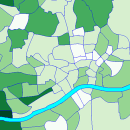
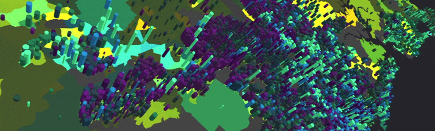
Visualising superdiversity through social networks
Interactive heatmap visualizing multidimensional relational-diversity evident in the social networks of respondents.
DivCon Intergroup Contact
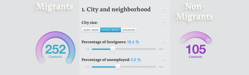
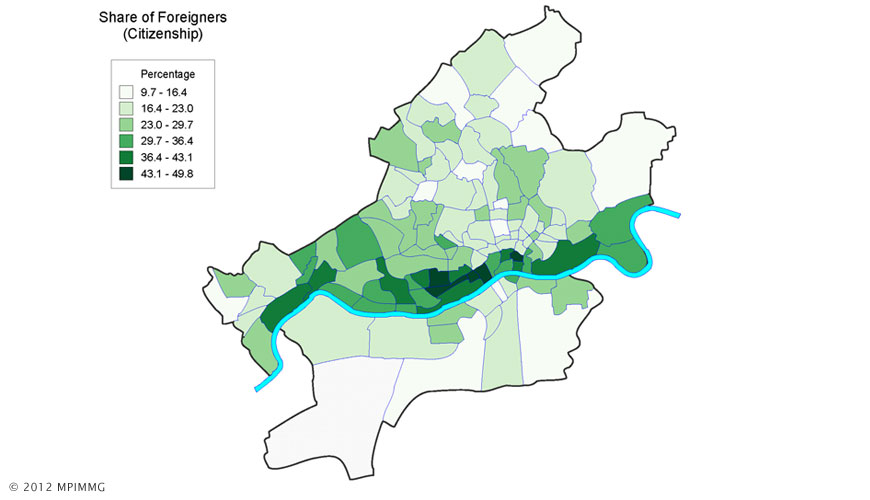
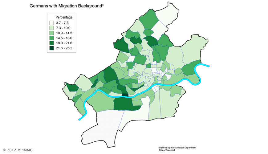
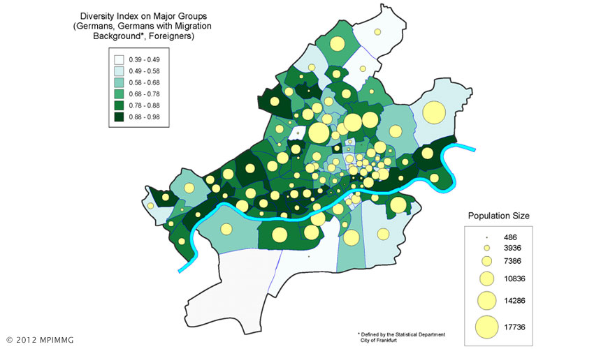
Explore how frequent contacts between migrants and natives take
place in a neighbourhood!
The contact calculator is based on a representative survey of
about 2,500 respondents aged 18 years or older in West German
cities of 50,000 or more inhabitants. Selected people live in 50
neighbourhoods of about 7,500 inhabitants on average. The survey
was conducted and analysed by researchers of the Max Planck
Institute for the study of religious and ethnic diversity.
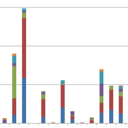
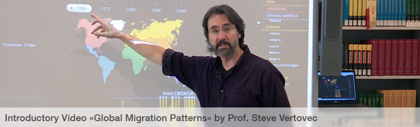
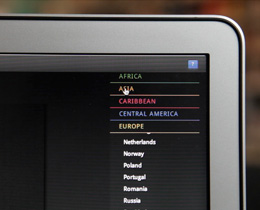
Global Migration Patterns
International Migration Flows

This interactive data graphic explores annual migration flows to
and from selected OECD-countries in the years 1970-2007.
Underlying data has been provided by the United Nations
Population Division.
The visualization illustrates the evolution of
»Superdiversity«, a term coined by Steven Vertovec
to reflect a level of societal complexity far beyond anything
observed in the world before. During the last two decades more
people than ever have moved between different locations
worldwide.
This process thus becomes approachable in an interactive, visual
way.
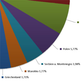
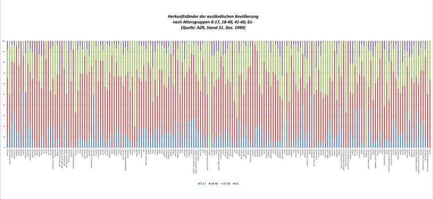
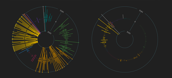
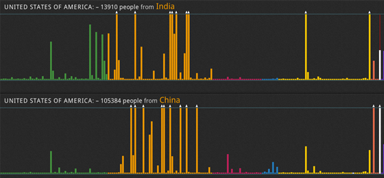
Global Migration By Origin
Visualization of societal diversity in 225 countries in the census-years 1960, 1970, 1980, 1990 and 2000. For each country in the list, population is grouped by origin, i.e. country of birth or alternatively - in a number of cases - by citizenship. Over decades, an emergent pattern of increasing diversity of societies can be observed. The underlying data originates from the Global Migration Database, a joint project of a research group of The World Bank and the UN Population Division.
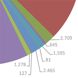
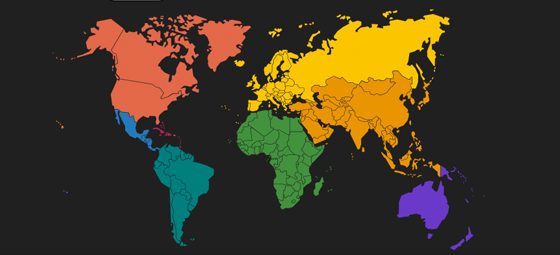
Global Migration By Destination
Same data as above, from an inverse perspective. Where do people leaving their country of birth move to? What countries or regions are the sources of »Superdiversity«?